The visual editor
The editor is where you build a flow with no code, organized into tabs. Everything autosaves to the draft as you work. This page walks through every field.
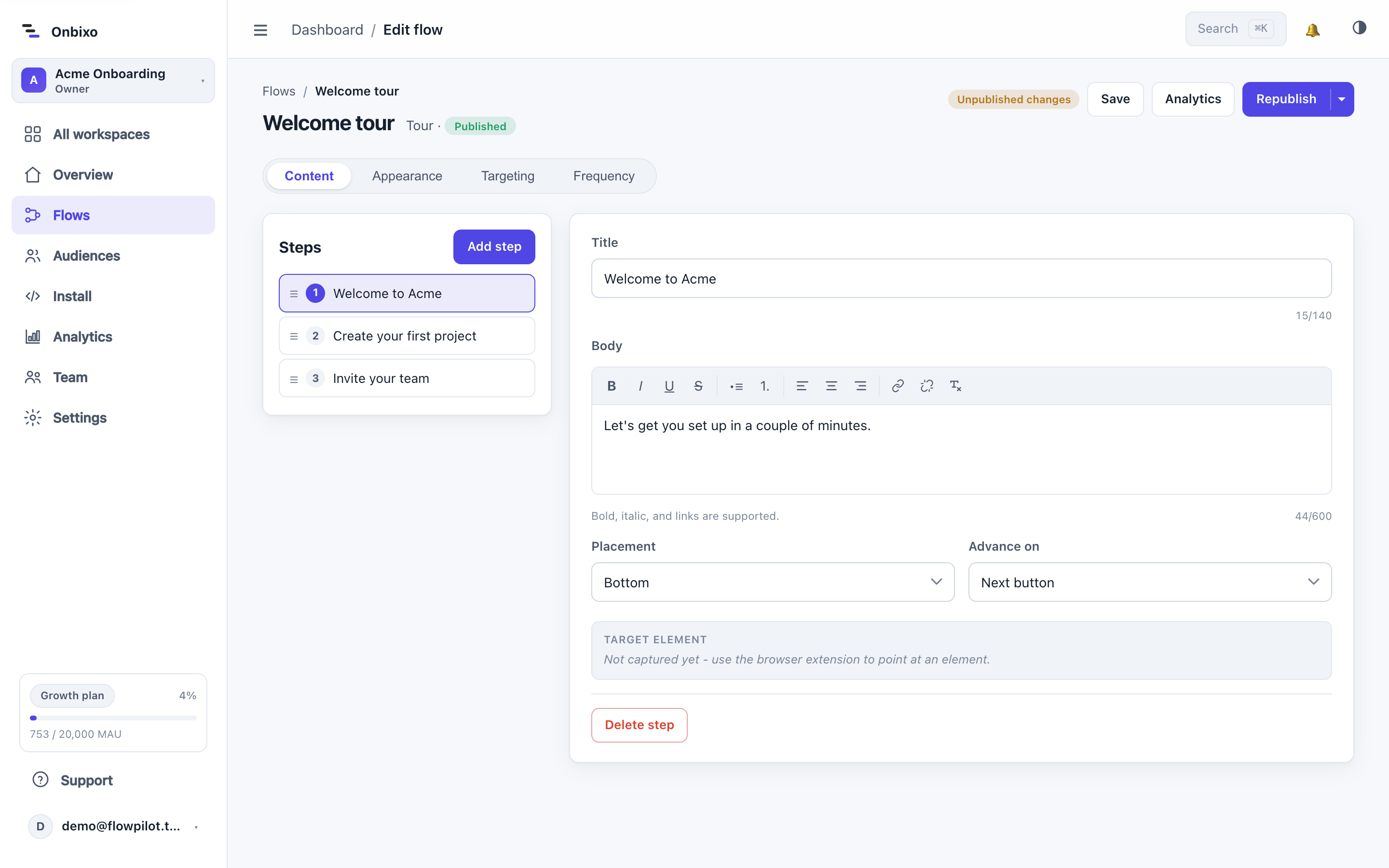
The tabs
| Tab | What you do there |
|---|---|
| Content / Items / Cards | The flow's substance - steps for a tour/tooltip, items for a checklist, cards for an announcement. |
| Appearance | Theme, colors, fonts, layout, and the live preview. See Appearance & theming. |
| Targeting | Who sees the flow. See Targeting. |
| Frequency | When it shows and how often. See Frequency & triggers. |
The first tab's name adapts to the flow type - "Items" for a checklist, "Cards" for an announcement.
Step fields (tours & tooltips)
Each step in a tour (or the single step of a tooltip) has these fields:
Title
A short heading for the step (up to 140 characters). A live character count helps you keep it tight.
Body
The explanation, edited in a rich-text editor. The toolbar supports bold, italic, underline, strikethrough, bullet and numbered lists, left/center/right alignment, and links (add / remove). Links are sanitized on save - only safe schemes are kept.
Target
The element the step points at. You can:
- Type a CSS selector (e.g.
#new-project-btnor.sidebar .create). - Or capture it with the browser extension, which stores a set of ranked selectors so the target keeps resolving as your app re-renders.
If an element cannot be found at runtime, the step is skipped rather than breaking the flow. An announcement has no target - its cards are positioned on the screen, not anchored to an element.
Placement
Where the step card sits relative to its target: Auto (default - picks a side that fits), Top, Bottom, Left, or Right. If the chosen side would run off-screen, it falls back to one that fits.
Advance on
How a step hands off to the next one:
| Advance | Behavior |
|---|---|
| Next button | The user clicks Next (default). |
| Clicking the target | Advances when the user clicks the step's target element - good for action steps. |
| Your app (manual) | Waits for your code to call onbixo.next() when your own action completes. |
Show tooltip on (tooltips)
For a tooltip, one control decides how it reveals: on load (with an optional dim/spotlight), on hover, or on click of the element (a subtle pulsing hotspot). Hover and click do not dim the page, so the hint stays out of the way.
Reordering and deleting
Drag steps (or checklist items) by their handle to reorder them, and remove any you do not need. A tooltip is a single step, so it has no step list.
Checklist items & resource-center content
A checklist's Items tab is a list of tasks - each with a title, optional subtext, and a "done when" rule (see Checklists). A resource center adds help-link and relaunchable-flow authoring (see Resource center).
Autosave and publishing
Edits save to the draft automatically - you will see a "Saved" indicator. The live flow is untouched until you Publish. A "Unpublished changes" pill appears when your draft is ahead of what is live. The header Save button flushes the whole editor at once and works on every flow type. See Draft, publish, archive.
The live preview
The Appearance tab's preview renders through the real runtime - the same code your users run - so what you see is exactly what ships. There is also a full-screen "Live preview" that plays the actual flow on a simulated app page.
Use "Clicking the target" advance for steps that ask the user to do something, and the Next button for informational steps. Mixing them makes a tour feel interactive rather than a slideshow.
Last updated: Aug 5, 2026