Announcements
An announcement is a multi-step modal for product news - a card-by-card way to tell users what's new, right inside your app, where the changelog email never reaches them.
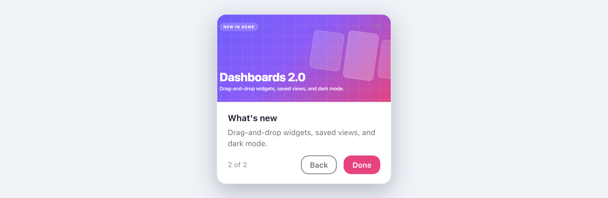
An announcement is a centered modal, not anchored to a control, so there is nothing for the builder extension to point at - you build it entirely in the dashboard editor. The extension is for the element-anchored flow types: tours, tooltips, and checklist click-targets.
When to use an announcement
Use an announcement to launch a feature, share an important change, or nudge a specific cohort. Unlike a tour, it is not anchored to an element - it is a standalone card (or set of cards) positioned wherever fits.
Building an announcement
- Create a flow of type Announcement and open the editor.
- On the Cards tab, add one or more cards. Each has a title, body, and an optional call-to-action.
- Set the position and entrance, and target who should see it.
Options
| Option | What it does |
|---|---|
| Multiple cards | Walk users through several cards with Next and Back and a step indicator. |
| Position | Center it, or tuck it into any corner of the screen (a 3×3 grid). |
| Entrance | Fade, slide, or scale as it appears. |
| Height | Fit each card, match the tallest card, or use a custom minimum height. |
| Dismiss | Dismissable, and it stays dismissed so it never nags. |
Targeting and frequency
Announcements shine with targeting - show a billing nudge to paying accounts, a feature launch to the people who will use it, and nobody else. Combine that with frequency caps (once, max-N, or a cooldown) so an announcement is seen but never repeated to annoyance. See Targeting.
Measure announcements like everything else - views, dismissals, and call-to-action clicks show whether your news actually landed. See Analytics.
Last updated: Aug 5, 2026